Old Navy: Subcategories in Hamburger Navigation
The hamburger navigation is a prime tool on mobile for searching products on e-commerce websites. The introduction of subcategories will further refine the search to help customers find exactly what they are looking for earlier in the funnel. Retail companies such as Uniqlo and Urban Outfitters adopt the use of subcategories to show the breadth and diversity of products within their product departments.
Problem Statement
How might we implement a subcategory experience for Old Navy’s navigation that has greater conversion and better key performance indicators compared to the first rollout of the feature?
Challenge
- Create an experience that implements subcategories within the hamburger navigation that directly correlates to the subcategories found on the PDP
- Build an experience that resonates with customers and has better conversion compared to the previous adoption
- Implement an innovative design that will stand out against competitors currently adopting the feature
Design Goals
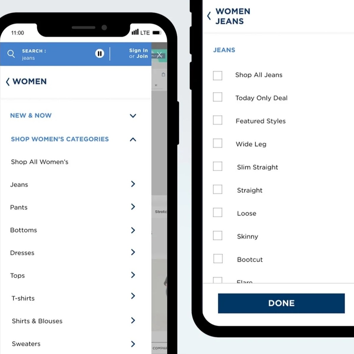
- Introduce breadcrumbs to the header menu as the user navigates across different subcategories
- Enact a condensed navigational view. Instead of expanding all categories, display women’s categories only. The other categories will be collapsed and users can choose what they expand instead of overwhelming them all at once
- Forgo the initial “Shop by Department Menu” header when you first click on the HamNav. Reshaping the format leaves room for formatting breadcrumbs
- Allow users to adopt the idea of “yes and...” If users have the choice to choose more than one of their favorite subcategories (i.e. skinny jeans, loose jeans, and overalls) they can have a more personalized experience
Final Product
In the experience I created, I shifted the idea of allowing the shopper to choose one subcategory, similar to competitors, to allow them to choose multiple to narrow their search. This new feature will allow users to have a more personalized experience by introducing a hybrid between filtering and searching earlier in the shopping funnel. This feature will also allow users to spend less time searching for exactly what they want and present them with what Old Navy currently has.
Overall, my hypothesis is the add to bag conversion will increase because the bounce rate will exponentially decrease when shoppers are able to shop for exactly what they are looking for without extra hassle.
A/B Test
To the left is a similar experience designed a couple years ago utilizing single-select versus multi-select. To the right is the multi-select experience my team and I designed. To evaluate which experience Old Navy customers resonated with more, a preference test was conducted by the Consumer Insights team.
Prototype Blue
Prototype Green
Methodology
Research Objectives
- Understand user preference between hamburger navigation experience with multi-select subcategories and with single-select subcategories when browsing for jeans.
- Determine customer sentiment related to the use of checkboxes and the “Done” button in multi-subcategory selection.
- Discover any pain points related to multi-select subcategory navigation experience.
Approach
- Remote unmoderated usability test
- 5-15 minute sessions
- Participants completed two navigation flows using two different prototypes (multi select subcategories and single select subcategory).
- Prototypes were alternated to eliminate any bias.
Sample
- n = 50
- All mobile shoppers
- All shopped/browsed apparel P12 months
- All shopped/browsed Gap Inc. brands in the past 12 months
Summary of Findings
The multi-select subcategory navigation experience was preferred by almost all
- Selecting more than one subcategory early in the navigation process saved participants time they would normally spend filtering on the category page.
The majority of participants reported they they were likely to shop 2-3 jeans subcategories at the same time
- It was important for participants to see both tried and true and new styles without being shown an overwhelming about of options
The multi-select subcategory navigation was preferred by almost all. Participants appreciated being able to select more than one style option before pressing Done. It made them feel like they had a more controlled shopping experience.
Participants preferred narrowing their search results by selecting multiple jean styles early in the navigation process. Participants claimed they saved time they would normally spend filtering on the category page.
Testimonials from Participant on the multi-select prototype.
Feedback from Participants
The jeans VI Banner created confusion for some when landing on the results page
- Participants expected to immediately see search results after clicking “done”, and seeing subcategories that they did not select created uncertainty that their menu selections had been applied.
When participants clicked “done” they saw the screen on the far left. Multiple customers reported that they expected to see the screen that just shows their number of items and the selections they filtered.
For the next iteration I made sure to note that I needed to improve the experience by having it scroll directly to the customers selections or to shorten the Women’s Jeans VI banner.
Testimonials from Participants
Comments and feedback were recorded from participants to share with the stakeholders and other cross functional partners. Comments touched on the visual design and functionality of the product feature.
Prototype
Future Iterations
- In a future iteration I would like to shrink the VI banner so when users click the “done” button they instantly see their results versus a banner that they can continue to filter on. Another solution could be scrolling automatically to the results and skipping over the VI banner altogether.
- I would like to test the feature for two weeks in a live environment to see if the general consensus of the experience is positive, and if there is more feedback/data from customers on the functionality of subcategories in the hamburger navigation. Furthermore, the data will help us determine if this feature should be adopted by other brands such as Athleta and Gap.
Learnings & Takeaways
- Create an MVP and a North Star
- Don’t be afraid to speak up and advocate for your design decisions
- Present your ideas throughout the ideation process and include engineers in the initial process/design presentation meeting
- Build and strengthen cross-functional relationships with others outside of the UX organization (PMs, Engineers, Customer Insights)
- Over-document for easy handoff
- Communicate Constantly