Anchor
Designed as a centralized platform, Anchor streamlines the jobs and internship search process, enabling students to focus on their goals without the stress of managing disjointed tools. Guided by a user-centered design process, we integrated critical resources into a single, intuitive platform tailored to the needs of University of Michigan - School of Information (UMSI) students.
Problem Statement
How might we leverage and reorganize University of Michigan - School of Information’s (UMSI) resources and network to increase the success rate of finding internships and post-graduate opportunities while decreasing the cognitive load for overwhelmed students?
Challenge
Jobs and internships are a cornerstone of the student experience, providing opportunities to gain real-world skills and build professional networks. However, for many students at the University of Michigan - School of Information (UMSI), navigating the job and internship process is an overwhelming challenge. Resources such as job boards, career events, and mentorship programs are scattered across multiple platforms, creating a fragmented and inefficient system. This disorganization often leaves students juggling competing priorities, missing deadlines, and feeling unsupported in their career journeys.
User Research & Key Insights
To understand the challenges students face, we conducted eight in-depth user interviews with UMSI students representing diverse academic tracks and personal backgrounds. These interviews provided a rich foundation of qualitative data that shaped the design of Anchor. We intentionally selected participants to reflect a diverse user base, including international students, first-years, and students transitioning into new fields. This diversity helped us uncover a range of pain points and opportunities.
💡 Key Themes
From the interviews, four dominant themes emerged, each shaping the design priorities for Anchor:
User Personas
To ensure that our solution reflected real user needs, we synthesized our insights into three personas, each representing distinct user groups. These personas guided our design decisions, keeping user needs at the center of every feature.
Information Architecture
The sitemap was created to act as a map of how we would lay out our website and how our users would navigate through it. The sitemap also allowed us to prioritize our information architecture and determine which pages would be the most important for our user base.
User Flow Diagrams
Usability Testing
Testing Protocol
We conducted usability testing with tasks like:
- Finding and connecting with a mentor.
- Registering for group mentorship sessions or events.
- Applying for jobs through alumni referrals.
- Saving job listings and updating skills on profiles.
Participants
Participants included undergraduate and graduate students from diverse MSI tracks, including MHI, Big Data, Agile Development, and LAKES, recruited through personal connections. Testing sessions were conducted over Zoom (15–20 minutes each) and recorded using Loom. One in-person session was also recorded. Participants interacted with low-fidelity prototypes built in Figma. These observations allowed us to validate design hypotheses before moving into product development, ensuring our solutions aligned with user needs.
Results and Key Feedback
Metrics tracked during testing included error rates, success rates, and time on task. Key insights and feedback included:
- Feed Tab Introduction: Initially, the resources tab lacked a social angle and was difficult for students to navigate. Replacing it with a feed format — highlighting primary, secondary, and tertiary connections — aligned better with modern data consumption habits of students and enhanced retention metrics like daily active users. We borrowed elements of social feed from common social media apps, by implementing the Jakob’s Law. This change aimed to improve user retention and daily active users.
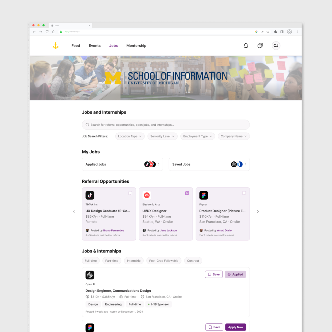
- Search and Filters for Personalization: Users disliked scrolling through long job lists. We implemented a search bar and advanced filters, leveraging principles like Hick’s Law (reducing cognitive load) and Selective Attention to personalize job and event results. This change aimed to improve click-through rates.
Participant Quotes
- “Last time I used UMSI career resources was when they first introduced them to us during orientation.”
- “I find the UMSI resources difficult to navigate.”
- “I try and find alumni with similar career trajectories so I can follow their footsteps.”
These insights confirmed the need for a social-first and intuitive design approach.
Design Iterations
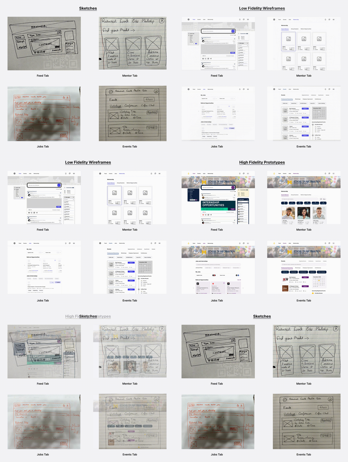
Based on the feedback, we introduced significant design improvements:
- Feed Tab: Replacing the static resources page with a dynamic feed featuring connections and personalized content.
- Search and Filters: Simplified job searches with easy-to-use filters and a prominent search bar, focusing on personalization.
- High-Fidelity Prototypes: Refined visual designs with a consistent style guide, improving usability and aesthetics.
- Referral Cards: Redesigned flows to highlight critical features like referral cards to ensure visibility and ease of use.
Before-and-after visuals of these changes highlighted their impact on usability and alignment with user needs.
Final Design
The usability testing and iterations resulted in a more intuitive and user-friendly platform. The final high-fidelity prototype addressed user pain points effectively and was ready for deployment, promising to enhance retention, engagement, and overall satisfaction.
The final design of Anchor embodies a seamless fusion of design thinking principles and Nielsen Norman’s usability heuristics to create an empowering, accessible, and intuitive platform for MSI students. By reimagining CareerLink, Anchor transforms the student experience into one that fosters connection, clarity, and career readiness.
Key Features
Event Details
The Event Details page serves as the primary touchpoint for students evaluating networking opportunities with alumni and industry professionals. Once a student discovers an event, this page provides the context, logistics, and registration tools needed to confidently commit to attending. The experience was designed to reduce uncertainty around professional networking events by making information easy to find, registration straightforward, and scheduling transparent.
2. Mentorship Dashboard
Anchor’s Mentorship Dashboard is a cornerstone feature designed to address inefficiencies in alumni engagement. Through a formal mentorship program, students can establish ongoing relationships with alumni beyond one-off coffee chats. This functionality leverages insights from user interviews, where students highlighted the need for deeper mentorship connections and transparency in alumni career paths. Alumni profiles on Anchor include customizable sections where they can specify their expectations for mentees, such as relevant coursework, projects, or skills. This transparency allows students to align their goals and curriculum with industry demands, fostering tailored and effective career development.
3. Application Tracker
The Application Tracker streamlines the internship and job application process by providing a cohesive space to track deadlines, application statuses, and employer feedback. User research revealed the fragmented nature of existing systems like CareerLink and Handshake, which often required students to navigate multiple platforms and log in multiple times. Anchor consolidates these processes into a single, intuitive interface, reducing redundancy and confusion. To further address participant concerns about tech industry cycles and deadlines, the tracker includes timeline structures and reminders tailored to internship cycles, offering students clarity and reducing stress.
Project Impact
Comments like “Anchor feels like the tool I’ve always needed” underscore the platform’s success in aligning with user needs. By integrating user feedback into iterative design, Anchor embodies design thinking’s emphasis on empathy, prototyping, and testing to create meaningful solutions.
Conclusion
Anchor reimagines the career navigation process, transforming it into a supportive, accessible, and empowering experience for MSI students. By addressing key pain points with innovative, thoughtful design, Anchor sets a new standard for how career platforms can serve students effectively. It not only provides a solution but also inspires confidence and connection in its users, ensuring their long-term career success.
Future Iterations
Looking ahead, Anchor has significant potential for growth and improvement:
- Developing a Mobile-First Approach: Our team understands the importance of mobile-first and in a future iteration of this platform we want to design the mobile web interface and a mobile application. This iteration will ensure that Anchor enhances accessibility to the platform on-the-go.
- Advanced Mentorship and Career Support: Expanding the mentorship feature with advanced matching algorithms can provide greater personalization, ensuring students connect with mentors aligned to their unique goals and career aspirations. Incorporating career-enhancing tools such as resume reviews, mock interviews, and portfolio showcases would further support students in preparing for competitive opportunities.
- AI-Driven Skill Development and Career Tracking: Introducing AI-driven functionalities can elevate Anchor’s capabilities, such as integrating algorithms to recommend Coursera courses for skill development tailored to individual gaps. A skill tracker feature could compile and analyze students’ strengths and areas for growth, providing actionable insights to help them stay competitive in the job market. Redesigning the career tracker to offer deeper insights and enhanced usability would create a more intuitive and robust tool for managing applications and tracking progress.
- Comprehensive Conference and Networking Opportunities: Additionally, Anchor could benefit from developing an in-depth conference feature, offering students detailed information about relevant events, participating companies, and opportunities to engage directly with recruiters. These future enhancements would further Anchor’s mission to empower students with the tools and resources needed to achieve career success, solidifying its position as an indispensable platform in the career development landscape.
Learnings & Takeaways
- Do not fall into the false-consensus effect. You are not the user. Start the research process with user interviews to learn more about the user’s wants and needs versus starting the research phase during usability testing. This will better inform your design and eliminate creator bias when designing for a population you identify with.
- Constant feedback throughout the design process from peers and team members will greatly improve the design in stages versus being overloaded with iterations towards the end.
- Establishing a design system and style guide will streamline workflow, ultimately improving consistency, agility, and collaboration among team members.
Credit (to my amazing team): Feyi Apampa, Sabrina May, and Niket Kamat Satoskar