Dr teal’s foaming bath soap
*click link to see original package design
challenge
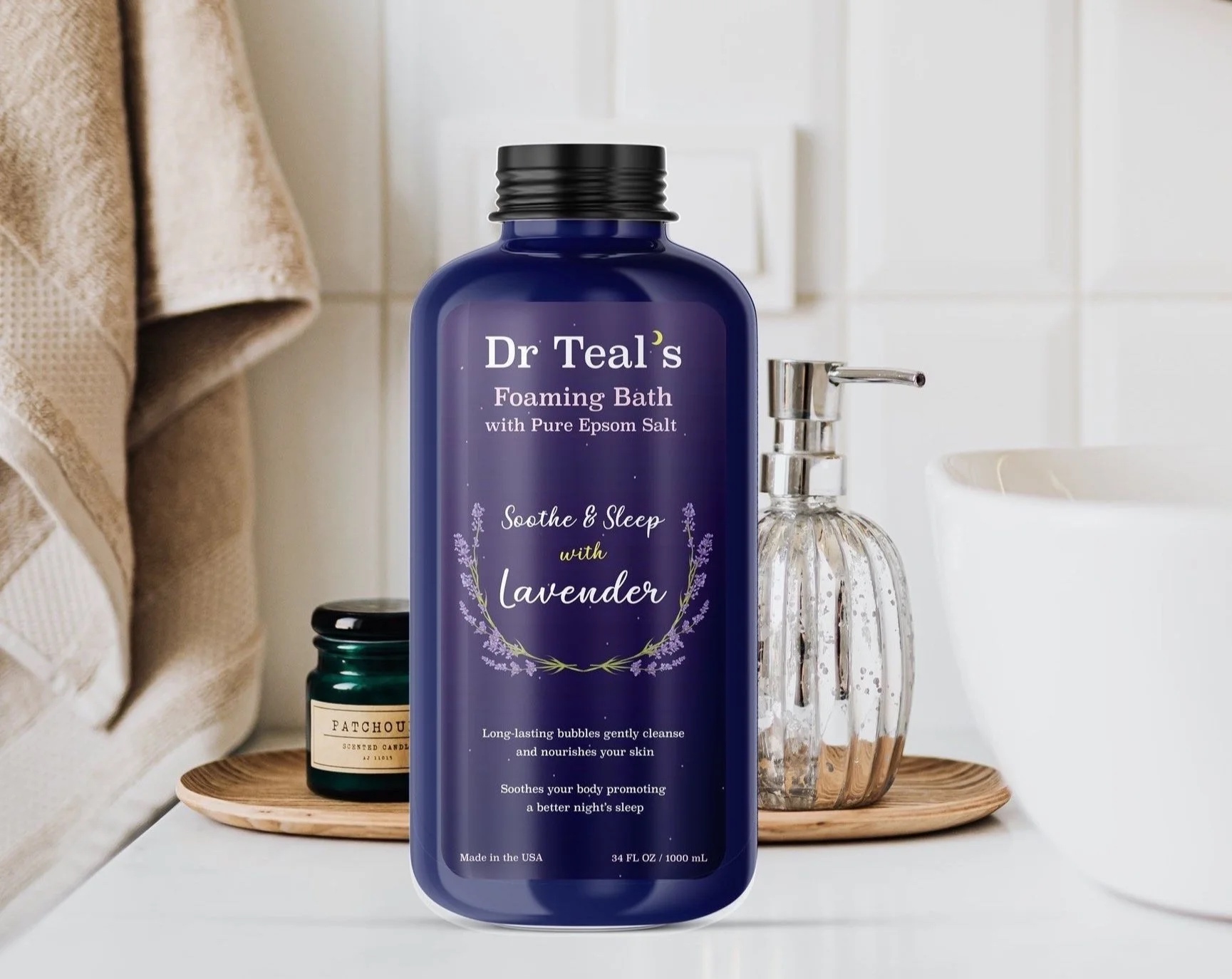
Redesign Dr. Teal’s Lavender Foaming Bath packaging design to embody the overall essence. In addition, make the design appeal to a more youthful audience to expand the market demographic.
Background
Dr Teal’s is a renowned brand known by women who are older and value the Dr Teal’s brand as a whole. Dr Teal’s is not very popular among many young people, so I want to expand the target audience to accommodate women of all ages. To elevate the product, I wanted to make the product look more youthful and fresher.
During my research, I wanted to see what current customers thought of the product by reading reviews on Amazon. From the reviews I took key words that would shape the design essence including: luxurious, relaxing, affordable, and not overpowering. Looking at the current design, while I notice that the plastic material aids in its affordability, the placement of words and images does not give off luxurious or relaxing energy. The lack of space and cluster of words is overwhelming to the eye.
Design goals
- Change bottle shape. Original is too bulky and awkward looking compared to competitors
- Make bottle color a deep purple instead of a navy blue
- Get rid of bullet points on original bottle
- Make the overall design match the ambiance it gives off when consumers use it
Product
In my design I wanted to convey what customers felt to what they saw visually on the product. To give the product a youthful look, I lessened the weight on the font of the title, played with the hierarchy of words, got rid of the bullet points, and added an illustrated element. To add to the relaxing element, I changed the white background to a darker one that resembled a nighttime sky and also related visually to other “soothe and sleep” products sold by Dr Teal’s.